
For years, designers were told to keep it sleek. Think minimalist logos, white space, soft tones, and lowercase sans-serifs—“clean girl” branding for the startup world. But in 2024, the playbook has changed. And if you’re still whispering to your customers, you might be getting drowned out.
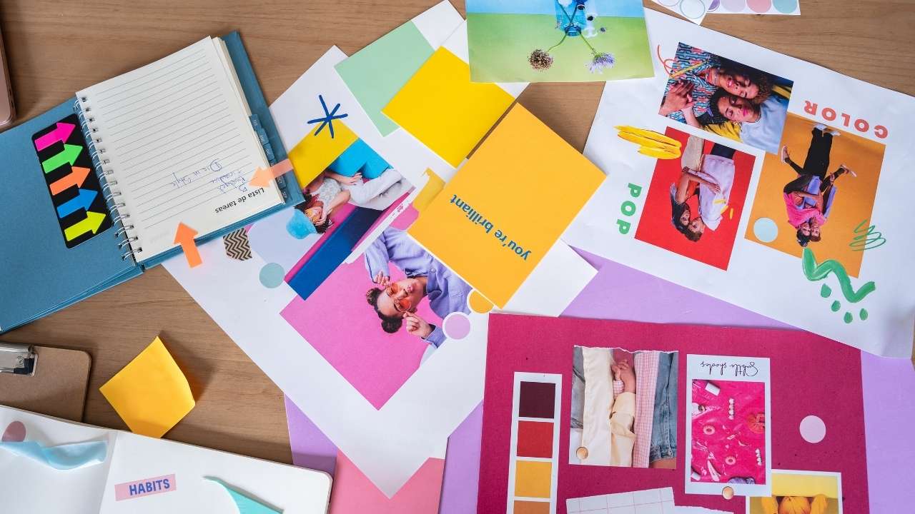
A new wave of packaging and branding is taking over the shelf—and it’s loud, weird, and working.
This insight inspired by Julia Garyfallou Northcraft, Sr. Director, Marketing & Sales for Timeless Skin Care
The Death of Safe Design
Sleek once felt premium. It gave brands a polished, professional edge, especially in the age of Apple and Muji-inspired aesthetics. But now, the visual landscape is saturated with quiet brands all saying the same thing.
The result? Silence.
Today’s consumers—especially Gen Z—aren’t impressed by another elegant bottle with a whispery label. They want something that demands their attention. Enter bold colors, chaotic fonts, personality-packed packaging, and branding that practically yells “LOOK AT ME.”
This is more than a trend. It’s a marketplace correction.
What the New Shelf Strategy Looks Like
Small businesses in the consumer product game—especially those on retail shelves or competing online—need to understand the new design language that’s winning:
- Bold colors – Think neon greens, eye-searing pinks, saturated oranges.
- Maximalist typography – Fonts with flair, character, and sometimes chaos.
- Intentional disorder – Graphics that break the grid (on purpose).
- Visible personality – Packaging that makes you feel the brand’s vibe.
- Just enough weird – A quirky tagline, an unexpected illustration, something to break the pattern.
10 Brands That Are Nailing It
These standout consumer brands are leading the charge by ditching minimalism and diving headfirst into bold branding:
- Liquid Death – It’s water in a tallboy can, wrapped in death-metal vibes. Iconic.
- Poppi – A gut health soda wrapped in a Gen Z Instagram mood board.
- Graza – Squeeze bottle olive oil designed to look like it belongs in a sneaker drop.
- Magic Spoon – A grown-up cereal brand that looks like Saturday morning cartoons on a sugar rush.
- Vacation Inc. – Sunscreen reimagined with nostalgic 80s ads and main character energy.
- Fly By Jing – Hot sauces and seasoning that explode in both flavor and visual impact.
- Flo – Feminine care that looks like Skittles. Loud, proud, and totally taboo-breaking.
- Ghia – A non-alcoholic spirit that’s all about dreamy colors and cool vibes.
- Goodles – Mac & cheese for adults who still love the 90s.
- Omsom – Asian pantry staples with packaging as flavorful as what’s inside.
Why Gen Z Is Driving This Shift
This new design direction isn’t random. It’s a direct response to the habits and preferences of Gen Z shoppers—now wielding more than $360 billion in spending power.
Gen Z doesn’t shop traditionally. They scroll. They scan. They judge faster and more emotionally than any generation before them. If your packaging doesn’t “click” in seconds, it’s gone.
They’re not reading paragraphs on your box. They’re reacting to your vibe.
They want to feel:
“This brand gets me.”
“This wasn’t made for my mom—it was made for me.”
And increasingly, they want to buy brands that reflect their personality, humor, and edge.
What This Means for Small Business Owners
If you’re a small business trying to get shelf space—or even just attention on a cluttered Instagram feed—your design strategy can’t be an afterthought.
Ask yourself:
- Does your packaging or branding stand out?
- Could someone describe your brand’s “personality” just from the visuals?
- Are you playing it too safe in an effort to look “professional”?
The best design today isn’t safe. It’s specific.
And that specificity—your unique voice, your “weird,” your color—is what converts attention into sales.
Final Thought: Brand Like a Human, Not a Template
Small businesses often feel pressure to mimic big brands. But the truth is, the most successful brands in 2024 feel human. They’re expressive, bold, and unafraid to turn heads.
So if your packaging, logo, or overall brand presence still looks like it was built in 2012—now’s the time to shake it up.
Because in today’s crowded market, minimalism gets ignored.
But color? Chaos? Character?
That sells.